
Visualization Story Components
This guide describes advanced data visualization components that you can bind to your Databricks tables in order to tell the story you you want with your data. This guide will also walk you through all of the steps needed to set these visualization components up within VDAB so you can start making apps with them!
Story Component Catalog
Our VDAB component catalog now includes eight advanced story visualization components. Unlike classic charts that plot points on axes, these visuals use spatial and organic metaphors so users can see where their data is strong, where it needs attention, and how it moves through stages, relationships, and time.
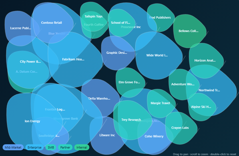
1. Amoeba Story
The Amoeba Story replaces a scatter plot with organic shapes so portfolio entities such as customers, products, vendors, projects, or departments can illustrate size, growth, health, and risk in one view. Size reflects the primary metric, expansion or contraction shows change, color and pulse encode health and risk, and entities cluster by category so leaders can spot value, outliers, and attention areas at a glance.
2. Network Web Story
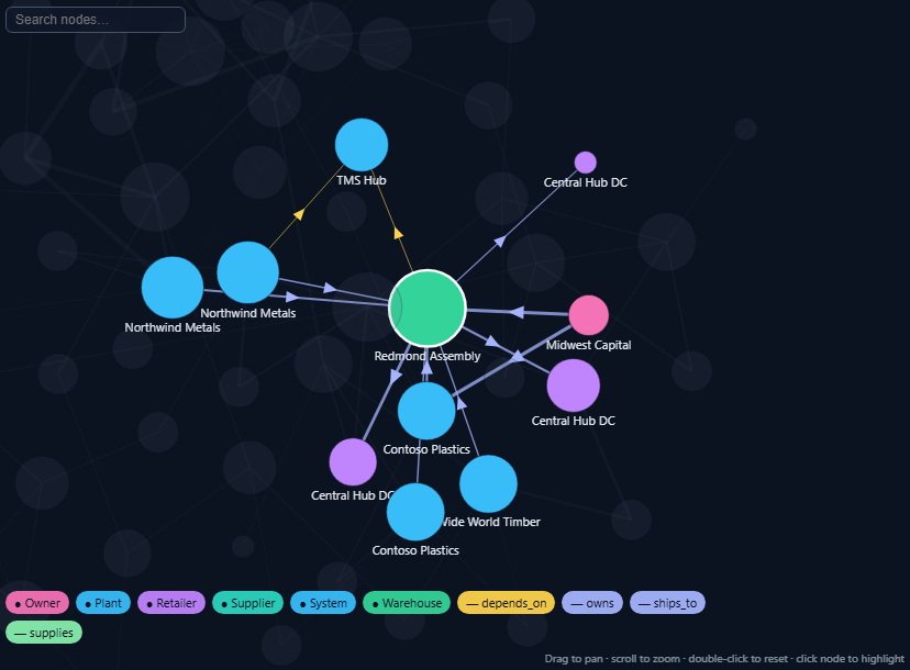
A Network Web Story maps relationships between entities as a connected web of nodes and edges which is ideal for supply chains, partner ecosystems, fraud patterns, application dependencies, and influence networks. Nodes are the entities and edge thickness and style show relationship strength and type. Optional risk and value cues highlight influential hubs, hidden dependencies, and high-risk paths.
3. Terrain Story
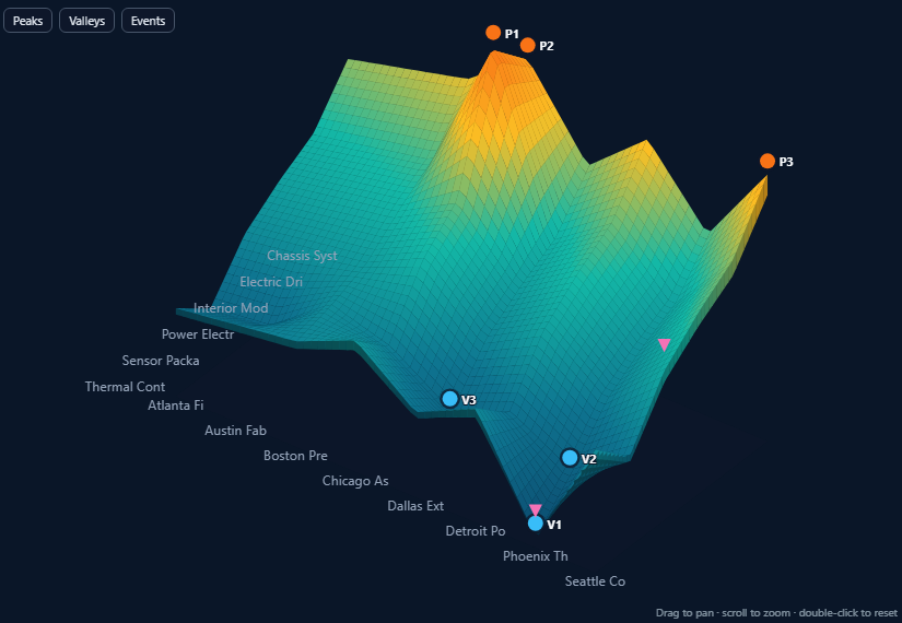
The Terrain Story turns performance into geography with peaks for strong results, valleys for weak spots, and steep slopes for sudden change. This story is useful to map dimensions such as region, product, plant, or time against a height metric like revenue, margin, or quality to compare landscapes and quickly find where performance is strong and peaking, slipping into valleys, or becoming risky.
4. Heat Map Story
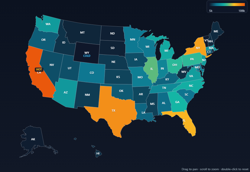
The Heat Map Story shades geographic regions by a business metric so location-based intensity is obvious. For example, sales by state, customer density, claims or incidents, campaign lift, or risk exposure. Each area’s fill intensity reflects the mapped value, making hotspots, cold spots, and regional clusters easy to compare across the map.
5. Pulse Wave Story
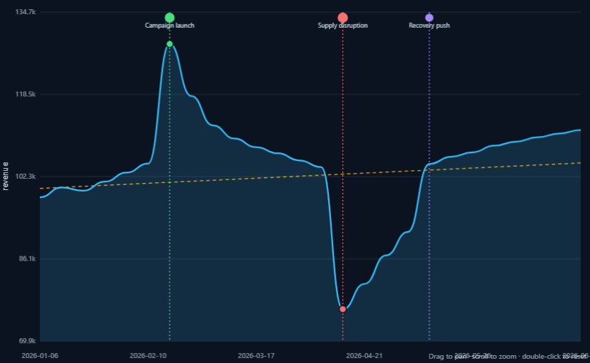
The Pulse Wave Story renders a metric’s rhythm over time as a living waveform instead of a plain line chart. Wave height tracks the metric, distance from a baseline shows variance, and optional event markers call out campaigns, disruptions, or other moments that align with spikes, drops, volatility, and recovery.
6. Flow Field Story
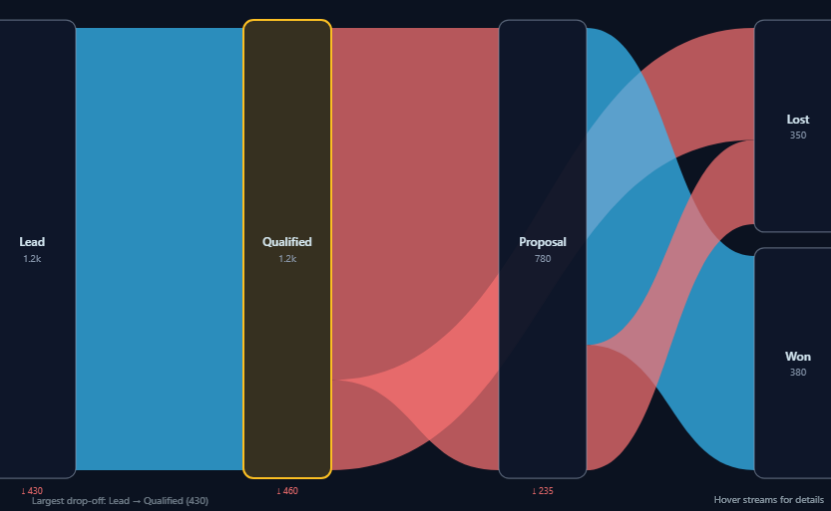
A Flow Field Story shows movement from stage to stage as directional streams, such as sales funnels, onboarding journeys, claims processing, hiring pipelines, or manufacturing flow. Stream thickness represents volume while conversion, drop-off leakage, and turbulence highlight bottlenecks, parallel paths, and where the process loses value.
7. Honeycomb Story
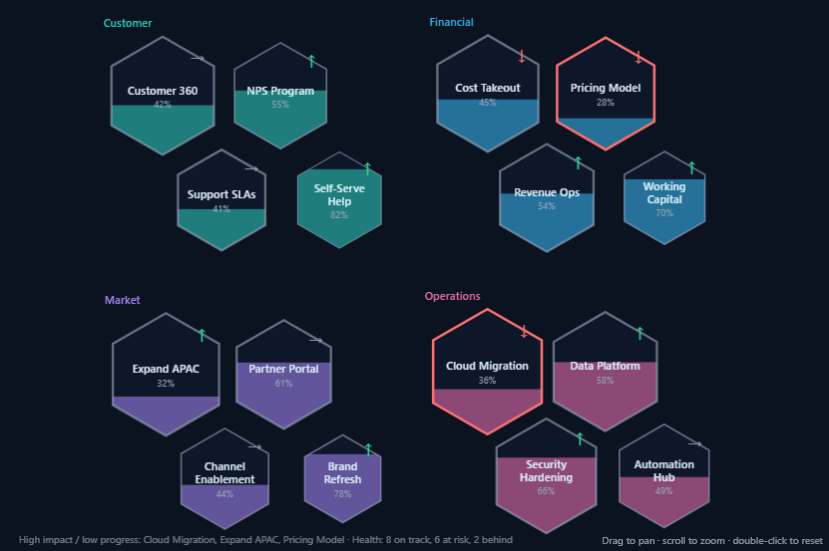
A Honeycomb Story presents strategic initiatives, objectives, capabilities, or scorecard items as a cluster of hexagons for planning and transformation views. Hexagon size reflects impact, fill shows progress, borders emphasize priority and risk, and category pillars group related work so leaders can see where investment, delivery pressure, and high-impact gaps concentrate.
8. Spiral Story
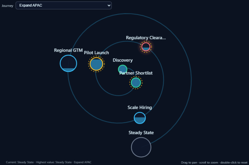
The Spiral Story replaces a flat timeline with a progressive spiral path for journeys such as transformation roadmaps, product lifecycles, maturity programs, or sales cycles. Milestones sit along the spiral by sequence or date. Progress fills the path, marker size reflects value delivered, and status or risk styling makes stalls, delays, and the next stage clear.
VDAB Implementation
Each of these Visualizations exist within VDAB’s component catalog. To add them to your app, simply ask the AI builder to add them, or drag and drop them into the canvas. Now that they exist within your app’s canvas, you need to bind them to data from a Lakebase or Unity Catalog table.
Make sure your user has proper Database Manage or Select permissions on Lakebase and Unity Catalog tables. Please reference Databricks documentation for how to do this.
Required App Resources
In order to properly get these visuals displayed, you must add specific resources to your app. Go into your VDAB app settings page and enter the Resources tab.
Lakebase Resource
If you are binding your data to a Lakebase table, you must add the Lakebase itself as a resource. After adding the Lakebase resource, save and deploy the app to instantiate the app environment variable PGUSER. Head to Databricks, locate your app, move to the Environment tab, and find the PGUSER value. Note this value down.
Now, go to your SQL editor, connect to the Lakebase, and then grant the following permissions for the desired table for your PGUSER (quotes around PGUSER matter):
GRANT CONNECT ON DATABASE <database> TO "<PGUSER>";
GRANT USAGE ON SCHEMA <schema> TO "<PGUSER>";
GRANT SELECT ON TABLE <schema>.<table_name> TO "<PGUSER>";
Unity Catalog Resource
If you are using a data table from the Unity Catalog, on your resource tab, add a UC Securable resource, setting it to your desired table. Then, add an SQL Warehouse resource connected to a Warehouse.
Then, go to your SQL editor, connect to the Serverless Starter Warehouse, and then grant the following permissions for each of the following tables for your PGUSER (backticks around PGUSER matter):
GRANT USE CATALOG ON CATALOG <catalog> TO `<PGUSER>`;
GRANT USE SCHEMA ON SCHEMA <catalog>.<schema> TO `<PGUSER>`;
GRANT SELECT ON TABLE <catalog>.<schema>.<table_name> TO `<PGUSER>`;
Binding the Table and Mapping Data Fields
Now, you can go back to VDAB, and select your story visual on the canvas, opening the properties tab. Locate the Bindings pane, and then select your binding type (Lakebase or UC), then bind it to the desired table you granted permissions to.
To confirm the binding worked, head to the Field Mapping section, and start mapping your data columns to the desired visualization section. For example, for a Terrain Story, you can add columns like Company Names and Product Names for the X and Y axes. Then you can select a column like Revenue for the metric, so a story displays peaks and valleys corresponding to revenue for different products and companies.